
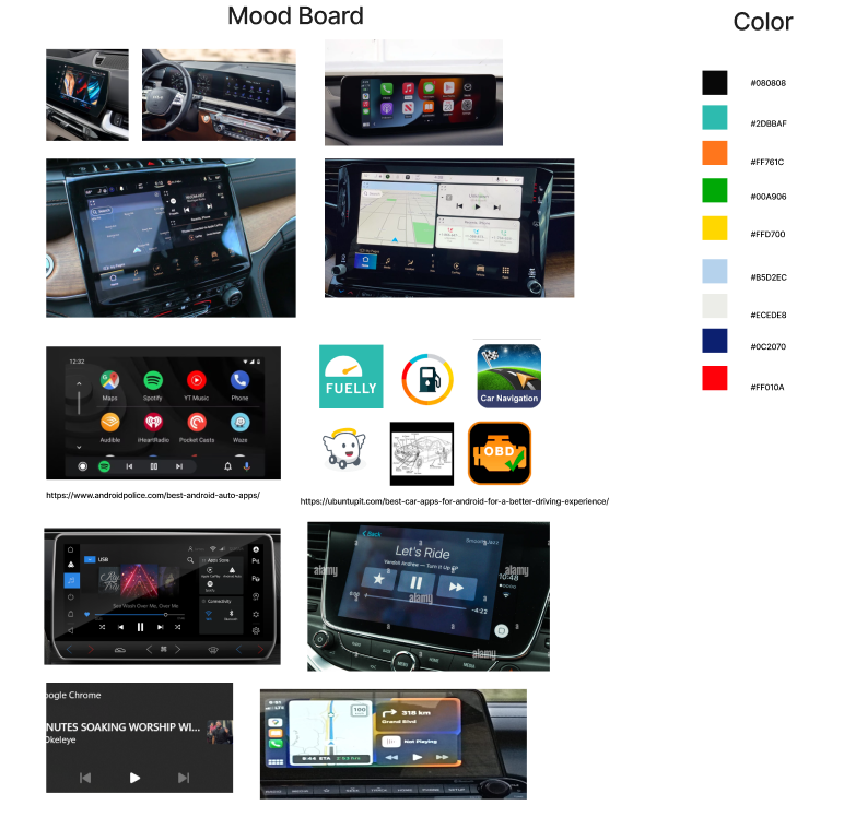
I initiated the project with thorough research on car infotainment systems, delving into standard sizes, colors, typography, and content.
Furthermore, I gathered insights from a car owner through an interview. These inputs informed my hand-drawn sketches and wireframes, created using Figma.
Through a process of iterative testing, I refined the design before presenting the final solution.

This was my first iteration of my wireframe. But after considering feedback from users, I modified the orientation to the final version I coded. I shifted the navigation to the bottom, accommodating both left-hand and right-hand drivers, ensuring ease of use for any driver.

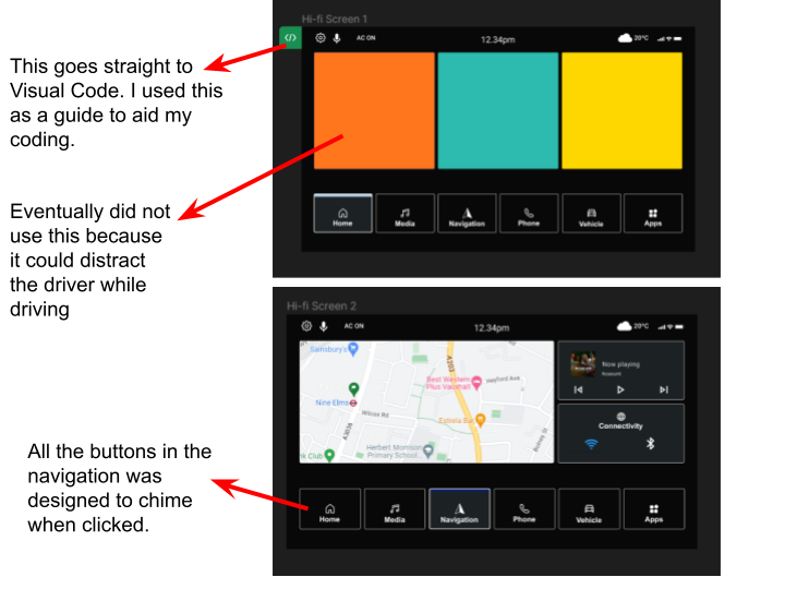
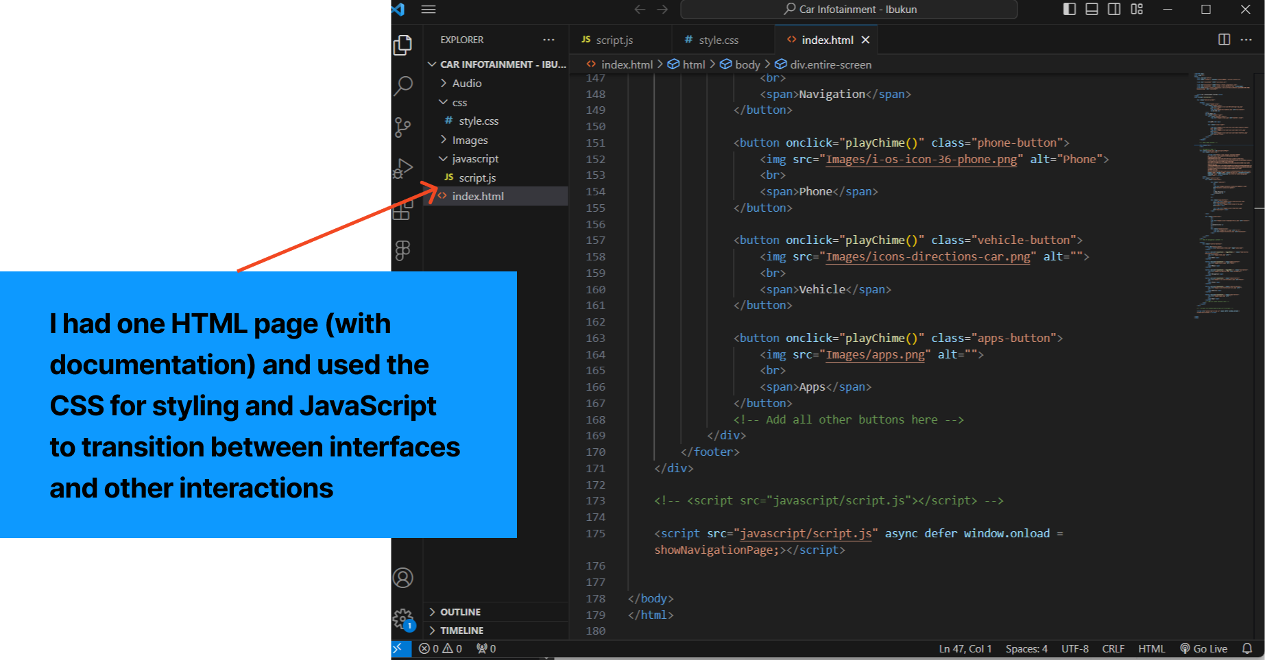
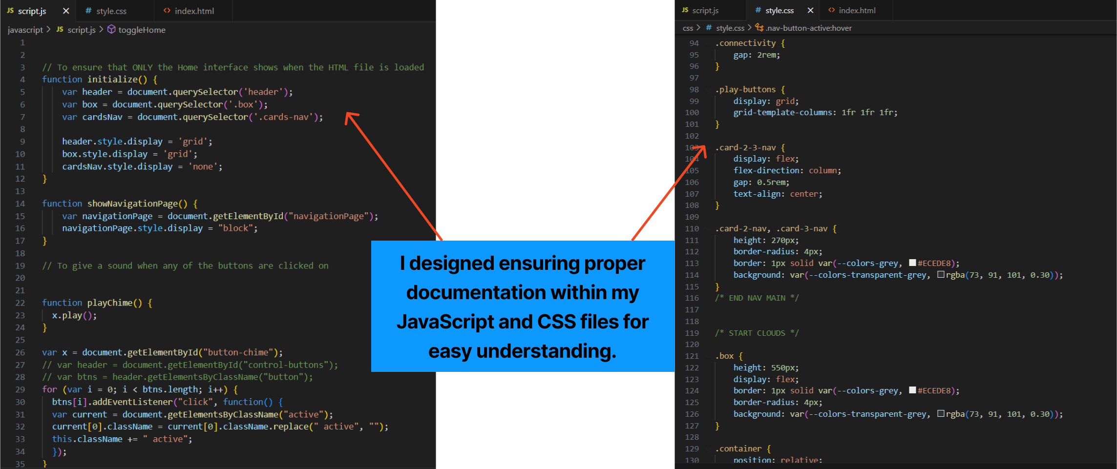
I utilized Words, Visual Representation, and Physical Objects dimensions in my interaction design to code a single HTML page. CSS handled the styling, while JavaScript added interactive elements such as button chimes, raindrop motion, and color changes on hover and click, as well as a transition between the home and navigation screens.
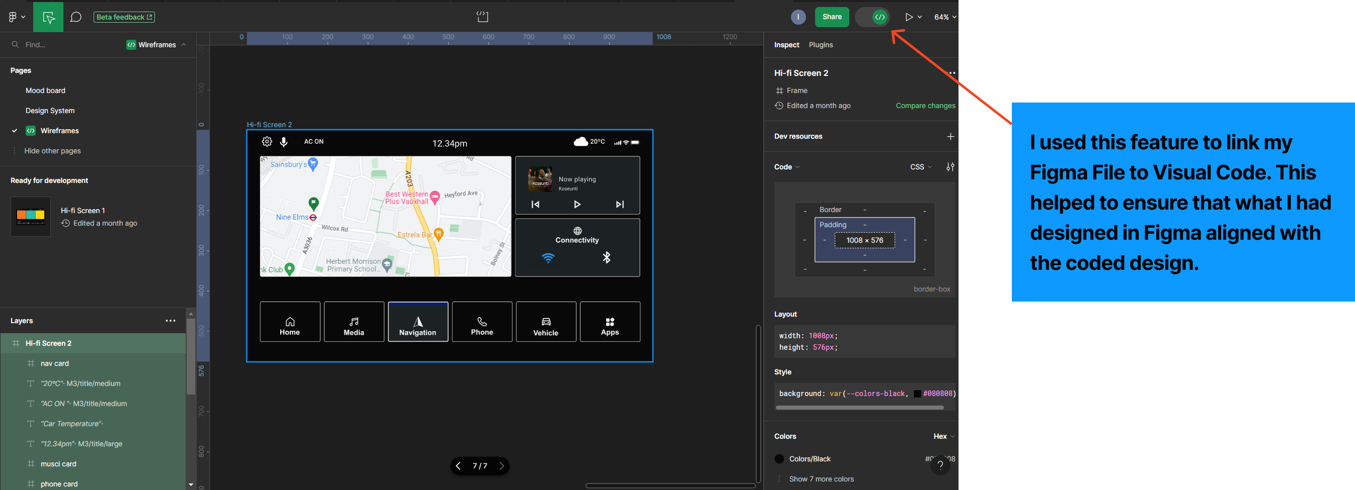
The tools I used were Figma and Visual Code. I also W3 Schools, CodePen, YouTube, and ChatGPT for research and learning purposes. I got my icons from the Material Design 3 from Figma, and downloaded images and some other icons from google and Freepik.

When designing, it's crucial to eliminate biases and cater to users from diverse locations. Therefore, I created an interface that ensures accessibility and user-friendliness for both left and right-wheel drivers globally.
Please watch the video below to see how the navigation functions. Thank you.